plot
postgkyl.output.plot plots 1D and 2D data using Matplotlib.
The Python function is wrapped into the plot command.
Default plotting
plot automatically regnizes the dimensions of data and creates
either 1D line plot or 2D pcolormesh plot using the Postgkyl
style file (Inferno color map).
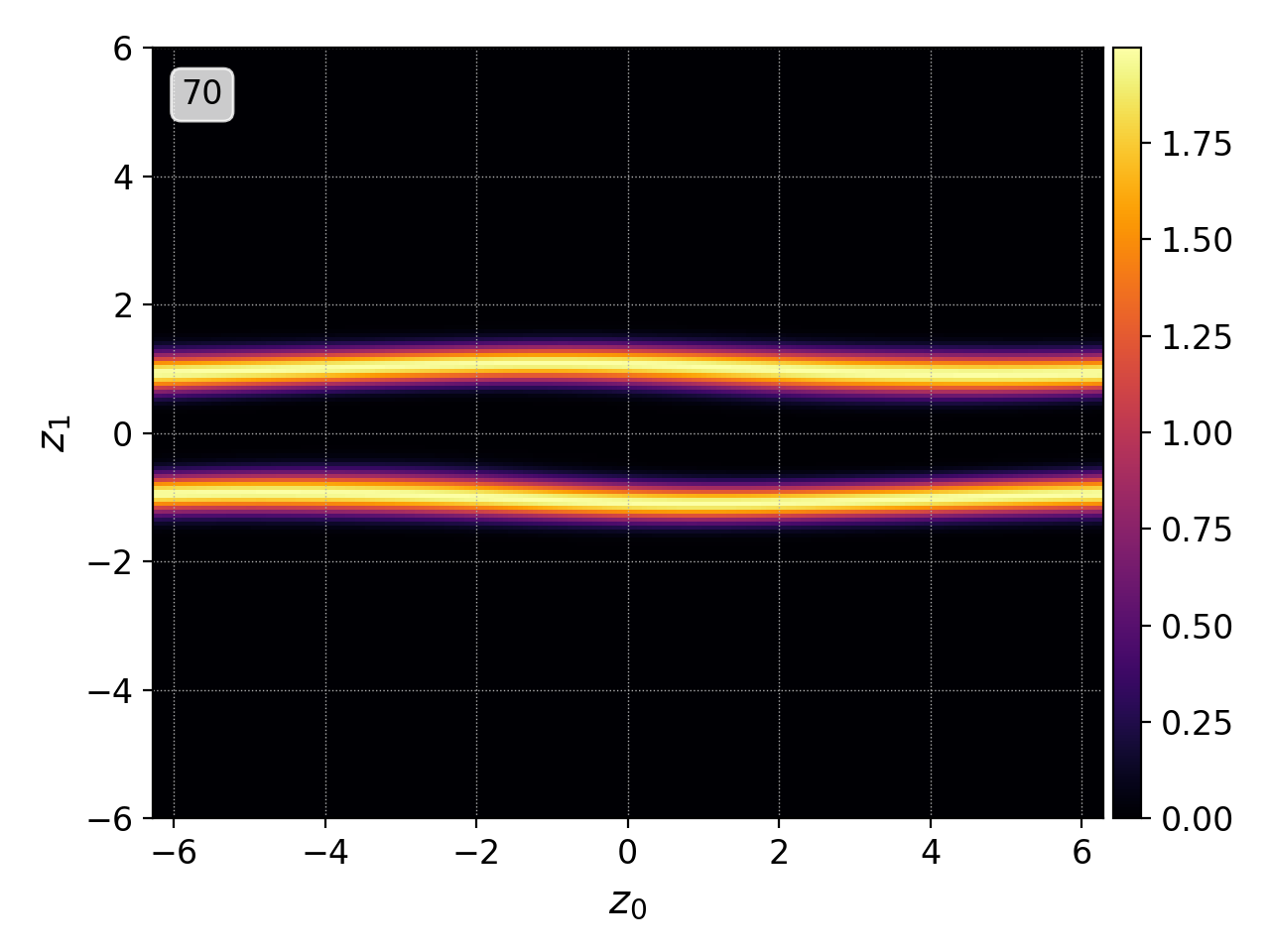
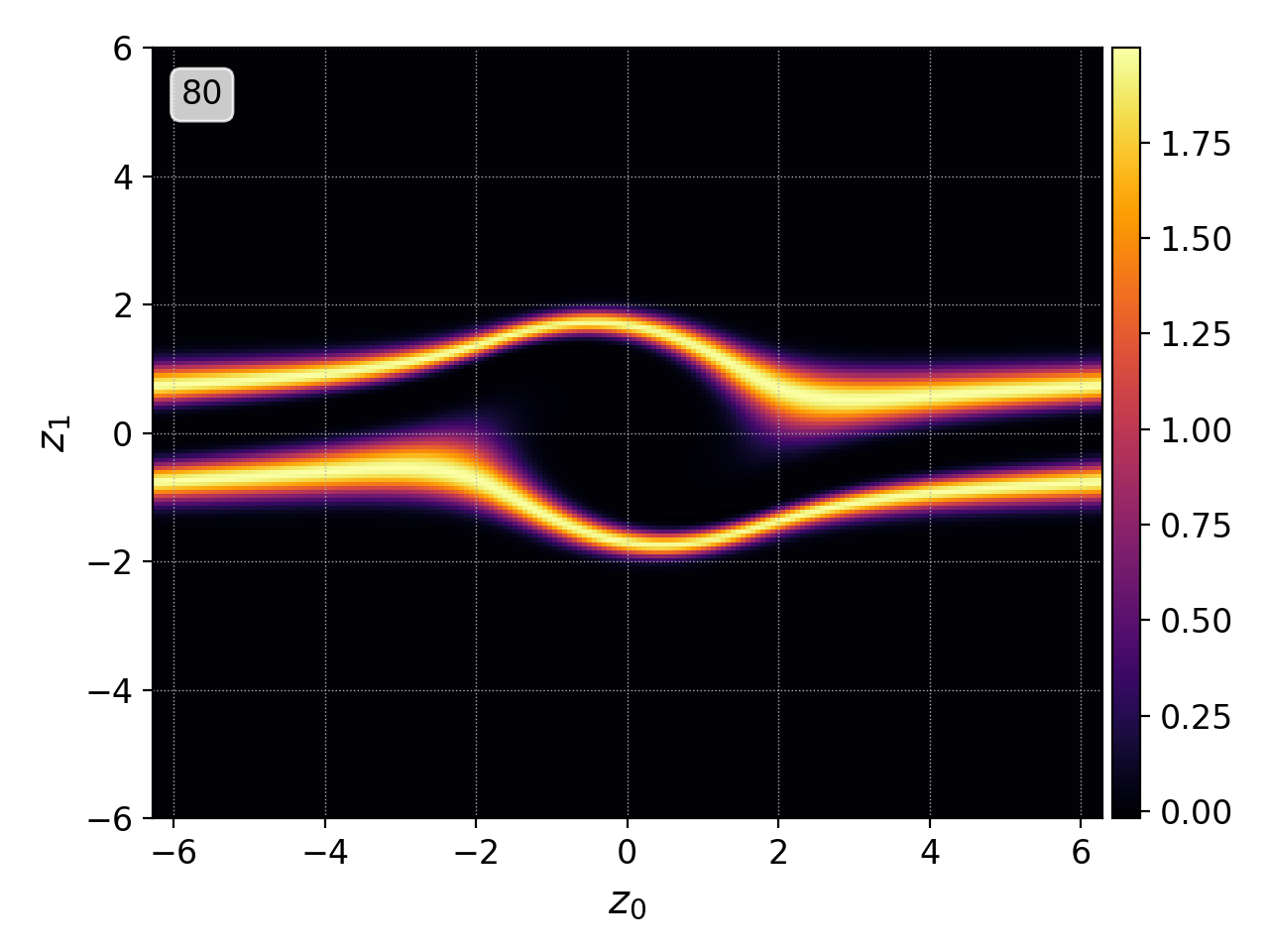
Here is an example of 2D particle distribution function from the two-stream instability simulation.
import postgkyl as pg
data = pg.Data('two-stream_elc_80.bp')
dg = pg.GInterpModal(data)
dg.interpolate(stack=True)
pg.output.plot(data)
pgkyl two-stream_elc_80.bp interpolate plot
Note that in this case the data does not contain the values of the distribution function directly but rather the expansion components of the basis functions. Therefore, interpolate was added to the flow to show the distribution function itself.
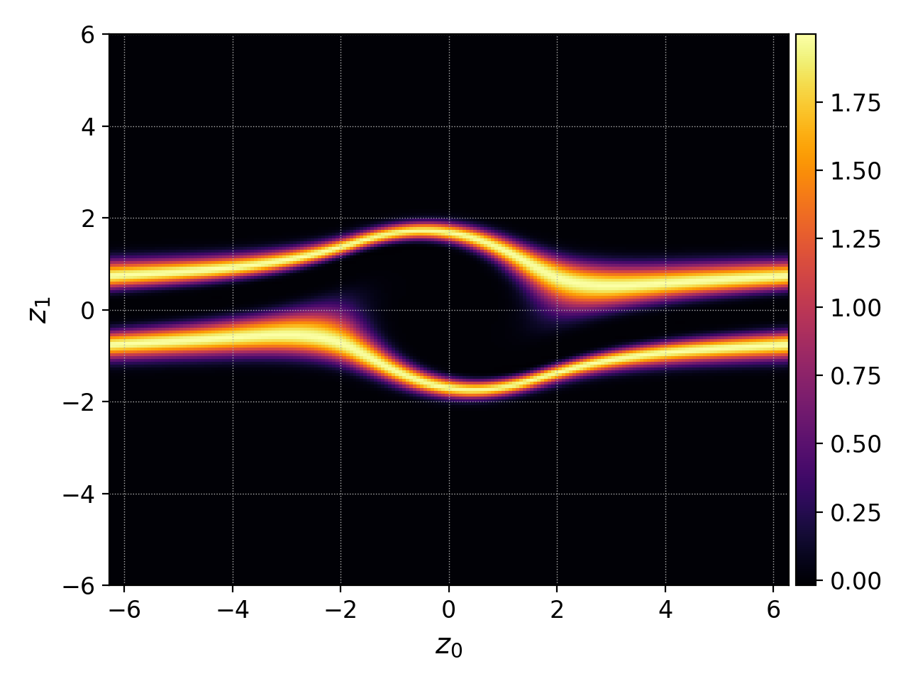
The default behavior of plot for 2D data
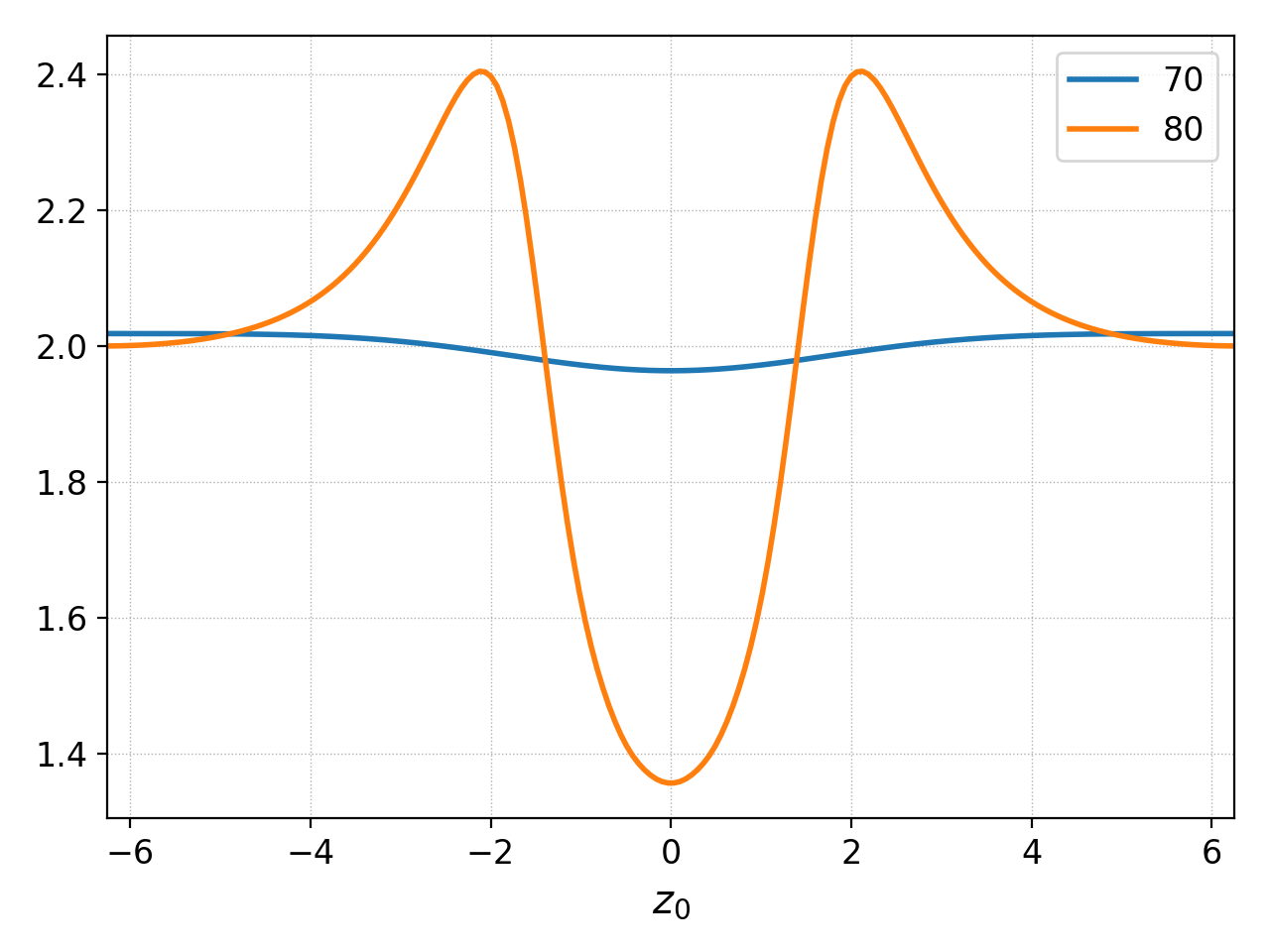
1D plots are created in a similar manner. For example, here is the electron density correfponding to the figure above.
import postgkyl as pg
data = pg.Data('two-stream_elc_M0_80.bp')
dg = pg.GInterpModal(data)
dg.interpolate(stack=True)
pg.output.plot(data)
pgkyl two-stream_elc_M0_80.bp interpolate plot
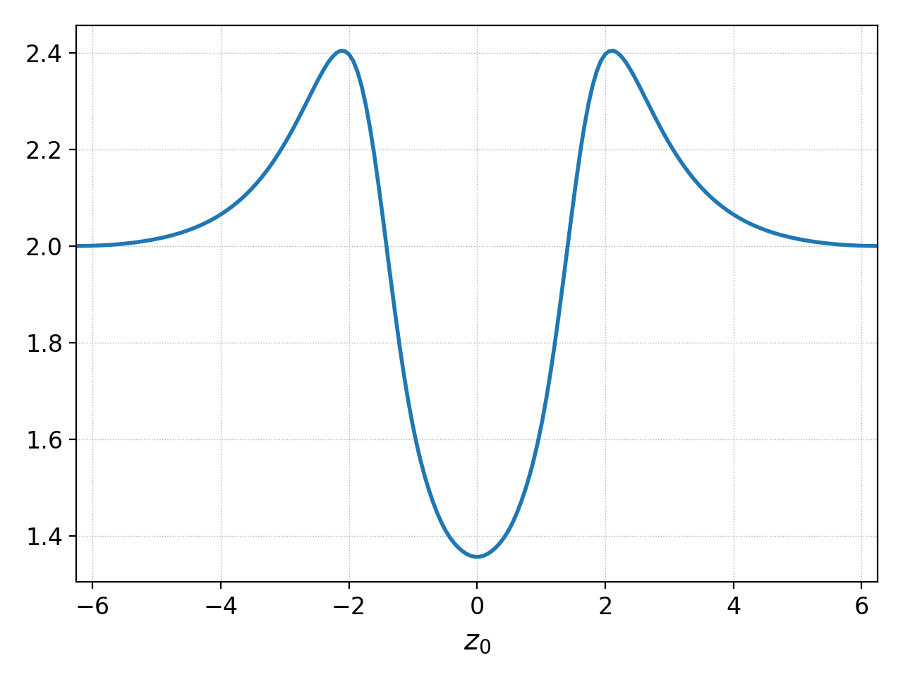
The default behavior of plot for 1D data
Plotting data with multiple components
Gkeyll data can contain multiple components. Typically, these are basis function expansion coefficients but can also correspond to components of a vector array like electromagnetic field or momentum. By default, Postgkyl plots each component into a separate subplot.
This can be seen if we do not use the interpolation from the previous example and let Postgkyl plot the expansion coefficients.
import postgkyl as pg
data = pg.Data('two-stream_elc_M0_80.bp')
pg.output.plot(data)
pgkyl two-stream_elc_M0_80.bp plot
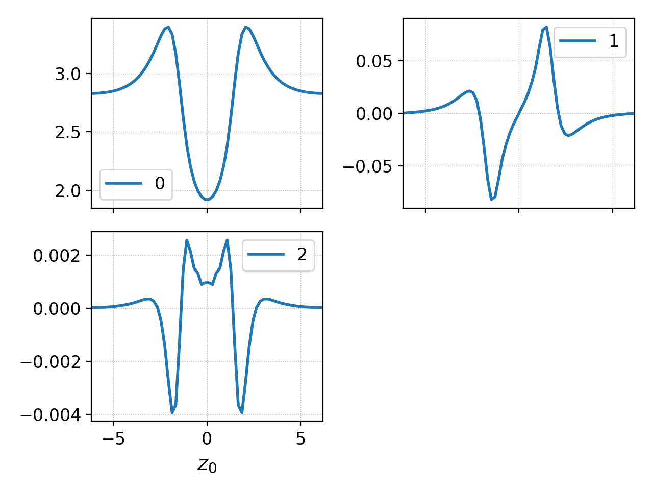
Plotting data with multiple components
Postgkyl automatically adds labels with component indices to each
subplot. If there are some labels already (either custom or when
working with multiple data sets), the component indices are
appended. Postgkyl also automatically calculates the numbers of rows
and columns (it tries to make a square). This can be overridden with
nSubplotRow or nSubplotCol.
The default behavior of putting each component to an individual
subplot can be supressed with the squeeze parameter. This is
useful, for example, for comparing magnitudes. Note that the
magnitues of the expansion coefficients are quite different so this is
not the best example of the functionality.
import postgkyl as pg
data = pg.Data('two-stream_elc_M0_80.bp')
pg.output.plot(data, squeeze=True)
pgkyl two-stream_elc_M0_80.bp plot --squeeze
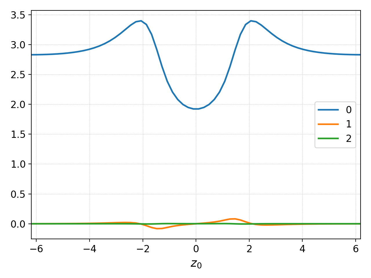
Plotting data with multiple components with squeeze=True
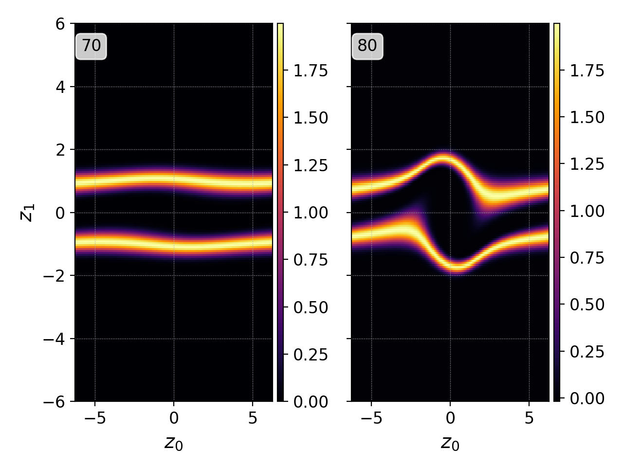
Plotting multiple datasets
Postgkyl in a terminal can easily load multiple files (see Data loading for more details). By default, each data set creates its own figure.
pgkyl two-stream_elc_70.bp two-stream_elc_80.bp interp plot
Postgkyl automatically parses the names of the files and creates labels from the unique part of each one. Note that the labels can specified manually during Data loading.
This behavior can be supressed by specifying the figure to plot in. When the same figure is specified, data sets are plotted on top of each other.
import postgkyl as pg
data1 = pg.Data('two-stream_elc_M0_70.bp')
dg = pg.GInterpModal(data1)
dg.interpolate(stack=True)
data2 = pg.Data('two-stream_elc_M0_80.bp')
dg = pg.GInterpModal(data2)
dg.interpolate(stack=True)
pg.output.plot(data1, figure=0)
pg.output.plot(data2, figure=0)
pgkyl two-stream_elc_M0_70.bp two-stream_elc_M0_80.bp interp plot -f0
Plotting multiple data set with specifying figure=0
Finally, the data sets can be added into subplots.
pgkyl two-stream_elc_70.bp two-stream_elc_80.bp interp plot -f0 --subplots
Plotting multiple data set with specifying figure=0 and
subplots
The same behavior can be achieved in a script as well but it requires slightly more manual control.
import postgkyl as pg
data1 = pg.Data('two-stream_elc_M0_70.bp')
dg = pg.GInterpModal(data1)
dg.interpolate(stack=True)
data2 = pg.Data('two-stream_elc_M0_80.bp')
dg = pg.GInterpModal(data2)
dg.interpolate(stack=True)
pg.output.plot(data1, figure=0, numAxes=2)
pg.output.plot(data2, figure=0, numAxes=2, startAxes=1)
Plotting modes
Appart from the default line 1D plots and continuous 2D plots, Postgkyl offers some additional modes.
Countour
import postgkyl as pg
data = pg.Data('two-stream_elc_80.bp')
dg = pg.GInterpModal(data)
dg.interpolate(stack=True)
pg.output.plot(data, contour=True)
pgkyl two-stream_elc_80.bp interpolate plot --contour
Plotting multiple data set with contour=True
Diverging
Diverging mode is similar to the default plotting mode but the colormap is changed to a red-white-blue and the range is set to the plus-minus maximum absolute value. It is particulary useful for visualizing changes, both in time and around a mean value.
Here we use the ev command to visualize the change from the initial conditions.
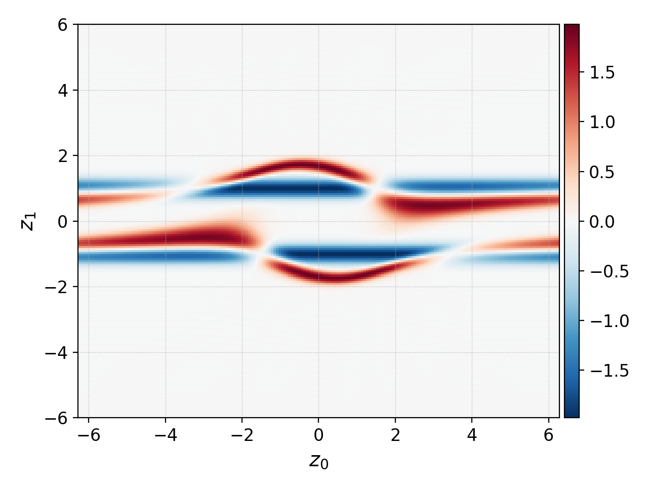
diverging mode is used to visualize changes from the initial conditions
Group
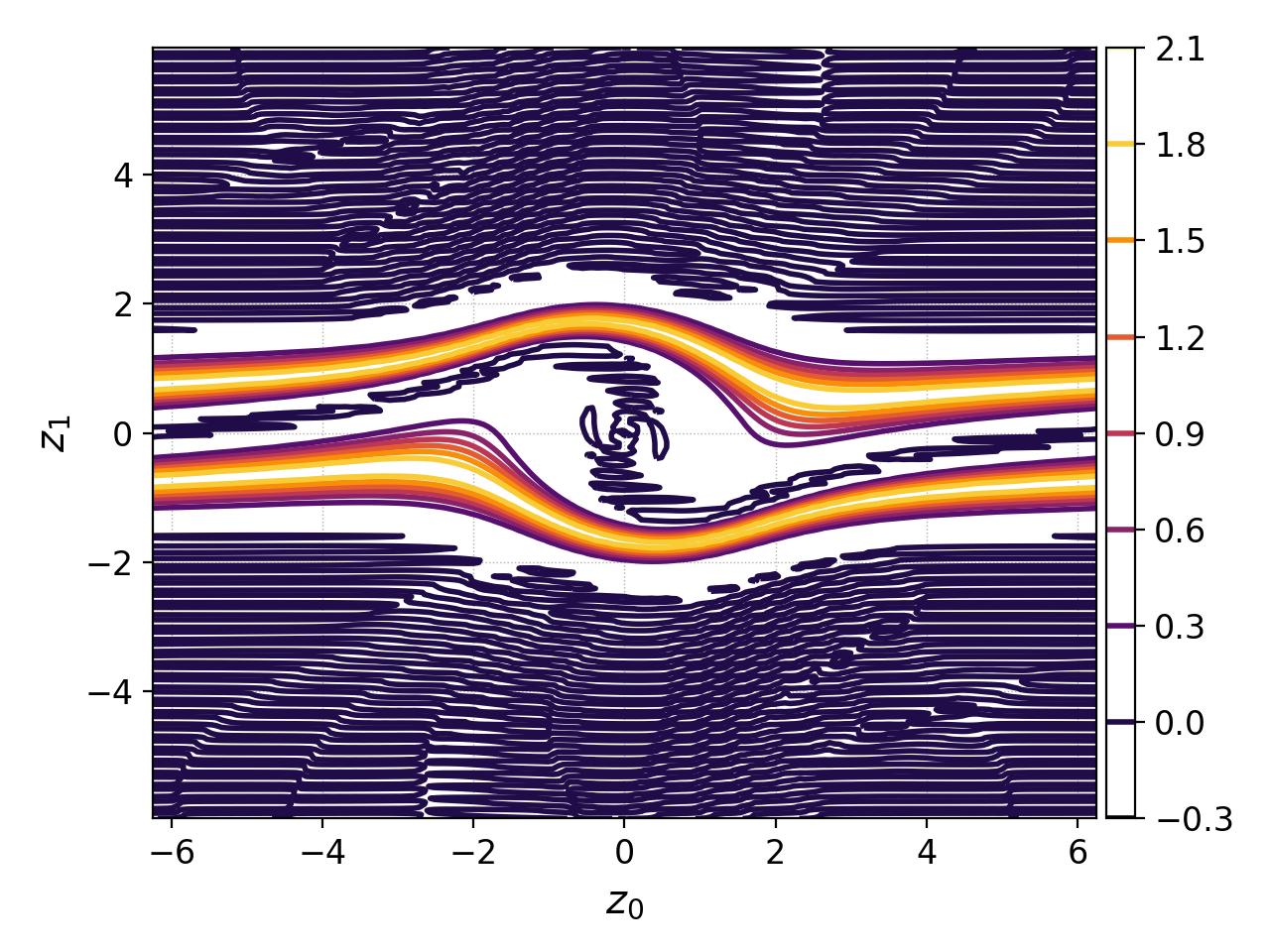
In the group mode (maybe not the best name :-/), one direction (either 0 or 1) is retained and the other is split into individual lineouts which are then plot over each other. The lines are color-coded with the inferno colormap, i.e., from black to yellow as the coordinate increases. This could provide an additional insight into variation along one coordinate axis.
In the example, the 2D distribution function is first limited in the
first coordinate, z0 (in this case corresponding to x), from
1.5 to 2.0 using the select command (otherwise there
would be too many lines). Then the plot with group=True is used.
import postgkyl as pg
data = pg.Data('two-stream_elc_80.bp')
dg = pg.GInterpModal(data)
dg.interpolate(stack=True)
pg.data.select(data, z0='1.5:2.0', stack=True)
pg.output.plot(data, group=1)
pgkyl two-stream_elc_80.bp interpolate select --z0 1.5:2.0 plot --group 1
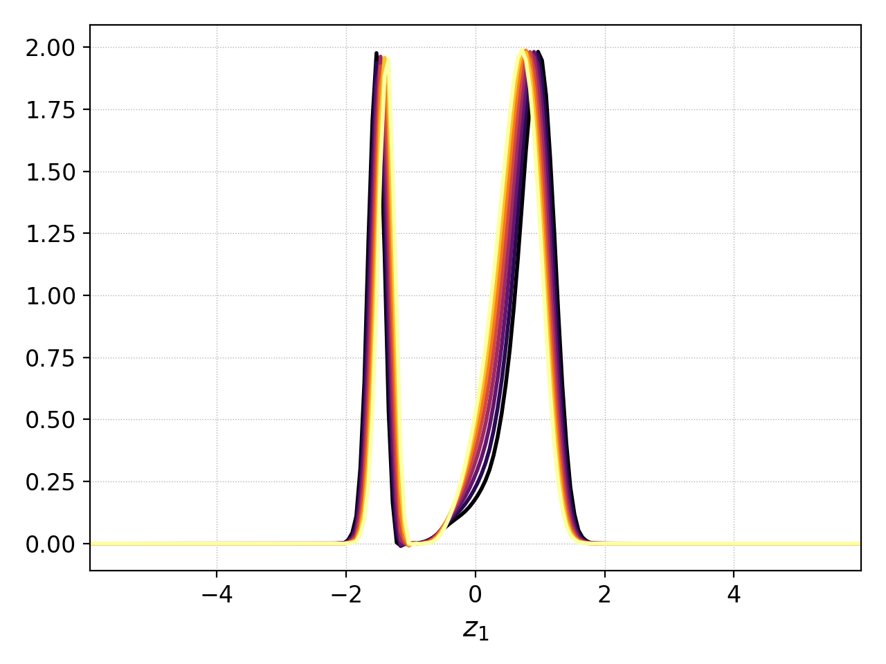
Plotting the distribution function limited to 1.5<x<2.0 with group=1
Formating
While Postgkyl is not necesarily meant for the production level figures for publications, it includes a decent amount of formating options.
The majority of a look of each figure, e.g., grid line style and
thickness or colormap, is set in a stule file. Custom matplotlib style
files can be specified with style keyword. The default Postgkyl
style is the following:
figure.facecolor : white
lines.linewidth : 2
font.size : 12
axes.labelsize : large
axes.titlesize : 14
image.interpolation : none
image.cmap : inferno
image.origin : lower
grid.linewidth : 0.5
grid.linestyle : :
Labels
Postgkyl allows to specify all the axis labels and the plot title.
import postgkyl as pg
data = pg.Data('two-stream_elc_80.bp')
dg = pg.GInterpModal(data)
dg.interpolate(stack=True)
pg.output.plot(data, xlabel=r'$x$', ylabel=r'$v_x$',
               title=r'$k=\frac{1}{2}$')
pgkyl two-stream_elc_80.bp interpolate \
plot --xlabel '$x$' --ylabel '$v_x$' \
--title '$k=\frac{1}{2}$'
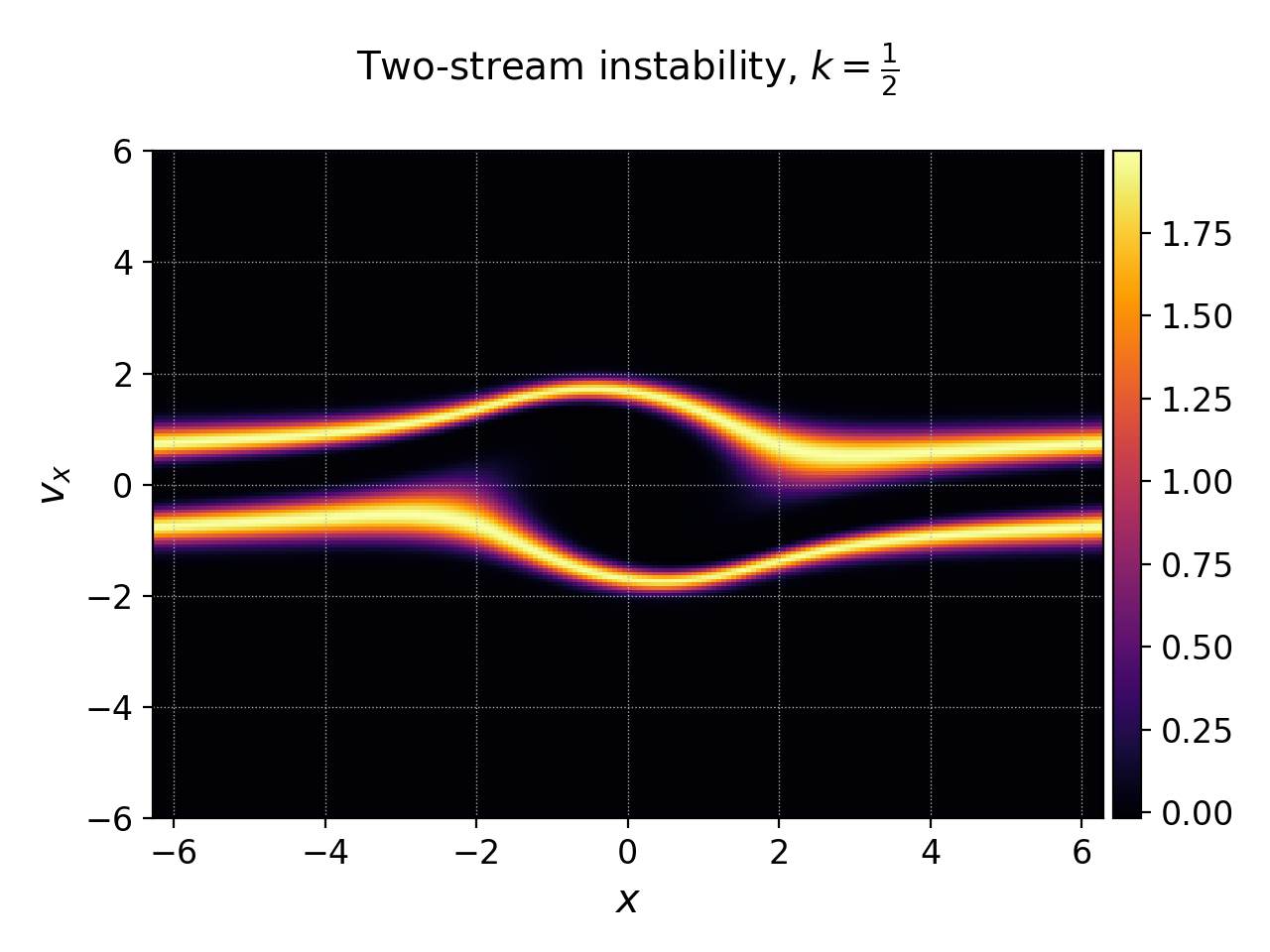
Postgkyl allows to specify axis labels and the figure title
Axes and values
Postgkyl supports the logaritmic axes using the keywords logx
and logy. In the example, the electric field energy is plotted
using the logarithmic y-axis to show the region of the linear growth
of the two stream instability. Note that Gkeyll stores \(E_x^2\),
\(E_y^2\), \(E_z^2\), \(B_x^2\), \(B_y^2\), and
\(B_z^2\) into six components of the fieldEnergy.bp
file. Therefore, the select command is used to plot only
the \(E_x^2\), which is the only component growing in this case.
import postgkyl as pg
data = pg.Data('two-stream_fieldEnergy.bp')
pg.data.select(data, comp=0, stack=True)
pg.output.plot(data, logy=True)
pgkyl two-stream_fieldEnergy.bp select -c0 plot --logy
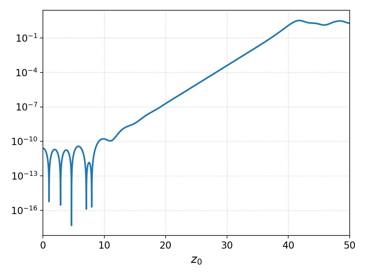
Plotting field energy with logy
Note that Postgkyl also incudes a diagnostic growth command that allows to fit the data with an exponential to get the growth rate.
Storing
Plotting outputs can be save as a PNG files using the save
parameter which uses the data set name(s) to put together the name of
the image. Alternativelly, saveas can be used to specify the
custom file name (without the extension, all the files are saved as
.png). DPI of the result can be controlled with the dpi parameter.